Educational
Battle of the Dashboards: Claude vs. TinyDash at NY Climate Week 🌍⚡
Two AI tools, one dataset, and a mission to turn Climate Week attendance stats into interactive dashboards
Sep 23, 2025 @ New York
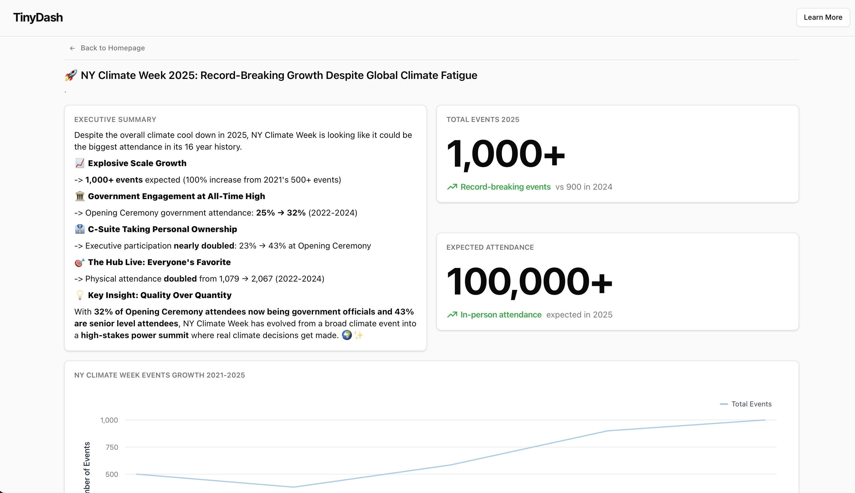
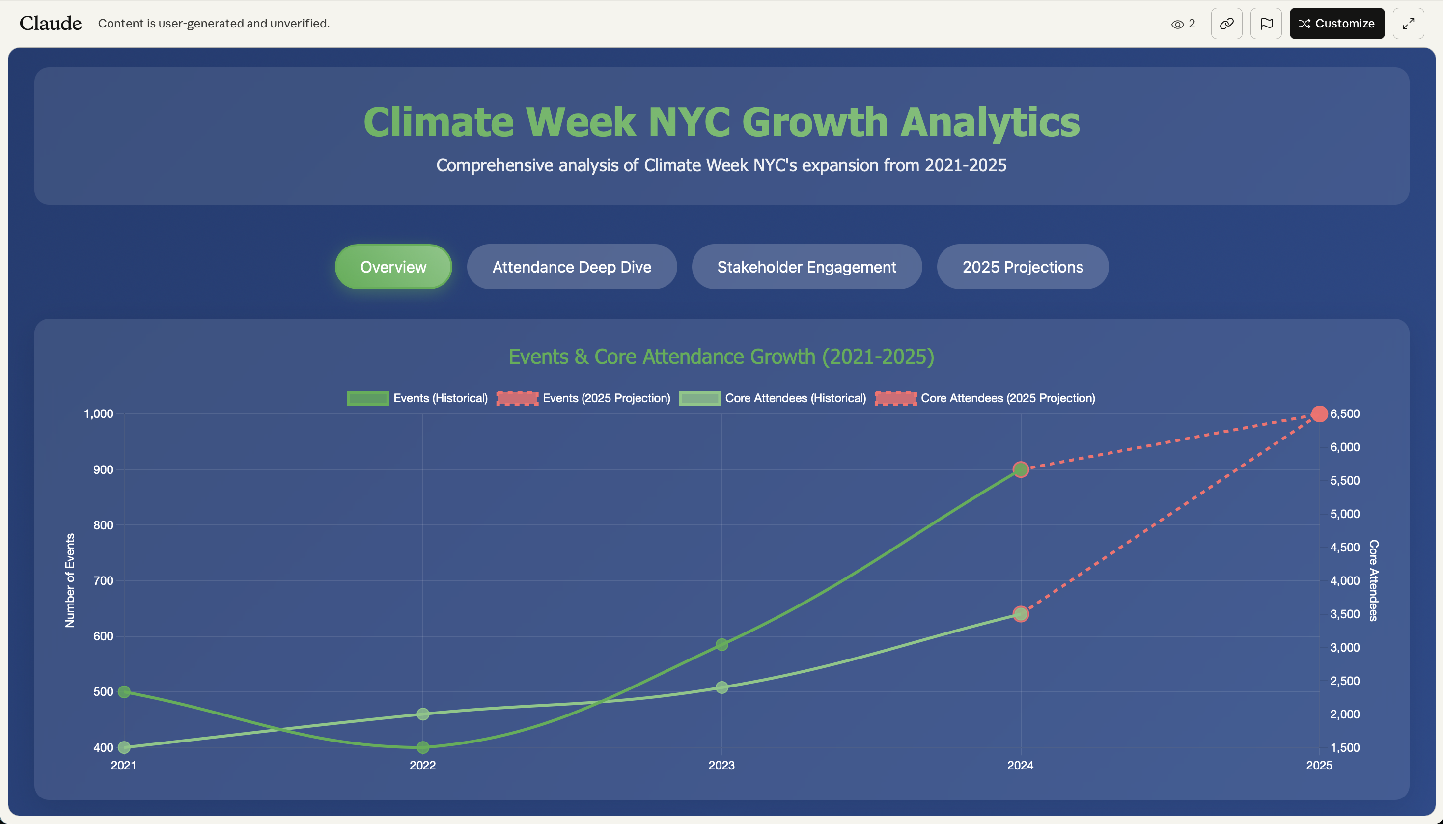
New York Climate Week 2025 is going big with nearly 1,000 events and 100,000 attendees. We decided to celebrate with our own competition: Claude vs. TinyDash in creating dashboards from Climate Week data.
New York Climate Week 2025 is going big—really big. Nearly 1,000 events crammed into one week, making it the biggest climate gathering in history. And an estimated 100,000 attendees set to flood the city.
To celebrate this record-breaking feat, we decided to throw down our own little competition: Claude vs. TinyDash. Two contenders, one dataset, and a mission to turn Climate Week attendance stats into shiny, interactive dashboards.
Who would come out on top? Here's what we got up to.
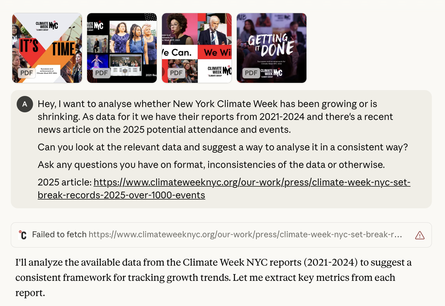
Claude dashboard start
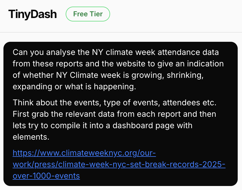
TinyDash dashboard start
🗺️ Step 1: Getting the Data (aka the Treasure Hunt)
The first task was simple: find attendance stats for New York Climate Week. The "simple" part ended when we realised that Claude couldn't access the source links we sent over. It was having some trouble with identifying where the annual reports for NY Climate Week were.
And so we kicked off some downloading, saving these reports as PDFs locally and then handing them over like sealed envelopes.
Lesson learned: always keep offline copies of your data if your AI tool is squeamish about URLs.
🤖 Step 2: Prompt Engineering & PDF Feeding
With the data in hand, we moved on to prompt engineering and feeding PDF reports into both Claude and TinyDash. The experience was a little different with each. TinyDash handled the uploads quite smoothly, while Claude bumped into the dreaded token limit wall. Picture trying to squeeze an entire IKEA catalog through a mail slot - essentially, only half of it makes it in.
We devised a workaround, spinning up a new conversation referencing that it had run out of tokens last time and to try again. This actually worked out in the end and Claude continued on its merry way.
🧹 Step 3: Cleanup & Chart Polish
The final stretch was all about cleaning the data and reformatting the charts. No matter which tool you use, this step is unavoidable. (Honestly, it's where analysts earn their stripes).
A few lessons stood out:
Double-check labels. AI can be surprisingly "creative" with naming. Always make sure your axes, categories and legends are accurate before sharing.
Validate the stats. Don't take every AI-generated number at face value. Cross-check against the raw data to avoid embarrassing slip-ups.
Save the style for last. Worry less about colors and aesthetics up front. Focus first on accuracy and clarity. Then layer on design polish once the data is solid.
In short: clean first, pretty later. Your future self (and your audience) will thank you.
TinyDash analysis: https://www.tinydash.xyz/shared/dashboard/ny-climate-week-growth-analysis_890ef590?page=growth-overview_d0cf7722
Claude analysis: https://claude.ai/public/artifacts/dc3a6fdb-e67b-47be-8b0a-389bc3d4865b
The Verdict
Both tools delivered impressive results, but each had their strengths. TinyDash excelled at handling large datasets smoothly, while Claude showed remarkable creativity in data interpretation and visualization approaches. The real winner? Anyone looking to turn raw climate data into actionable insights.
As New York Climate Week continues to grow, tools like these make it easier than ever to understand the scale and impact of our collective climate action efforts. Whether you're tracking event attendance, analyzing participation trends, or building dashboards for stakeholder reporting, AI-powered analytics are transforming how we make sense of the climate movement's momentum.
Want to explore similar AI-powered analytics for your climate data? ClimateAligned offers comprehensive data solutions tailored to sustainable finance and climate action initiatives.
ClimateAligned leverages AI-powered analytics to provide unprecedented insights into climate finance and sustainability trends, helping investors and organizations navigate the transition to a low-carbon economy.